Spinal Elements Corporate Colors
In a world of sensory overload and media bombardment we provide a calm environment where the observer can easily focus on the product without distraction or other obvious attempts at emotional manipulation.
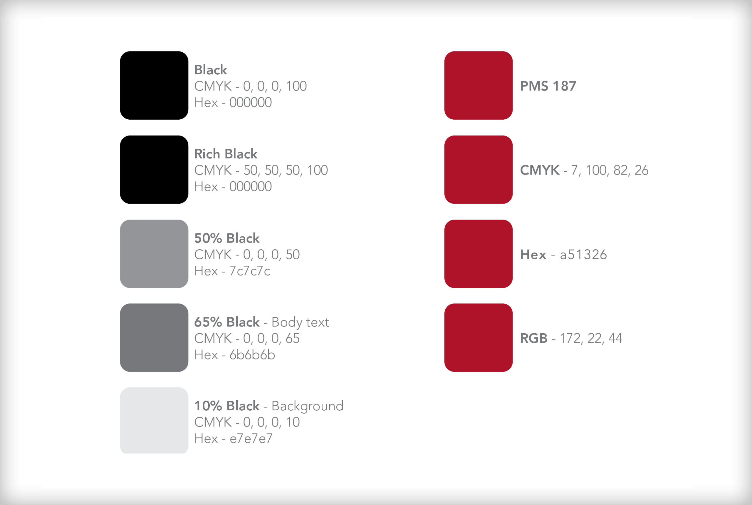
Spinal Elements Red
PMS – 187
CMYK – 7, 100, 82, 26
Hex – a51326
RGB – 172, 22, 44

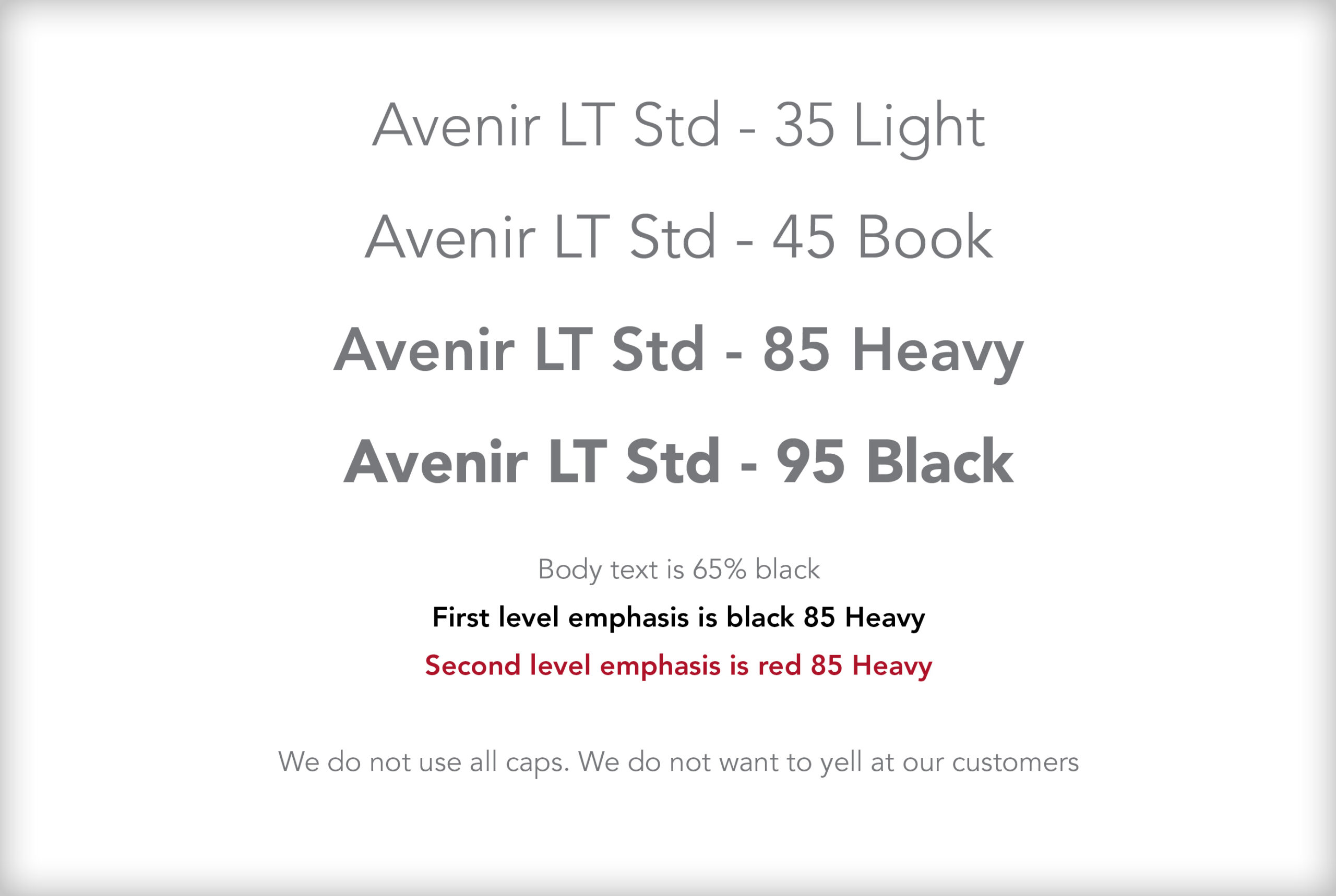
Spinal Elements Corporate Type
Spinal Elements uses Avenir LT Std as our corporate font.

Design Elements
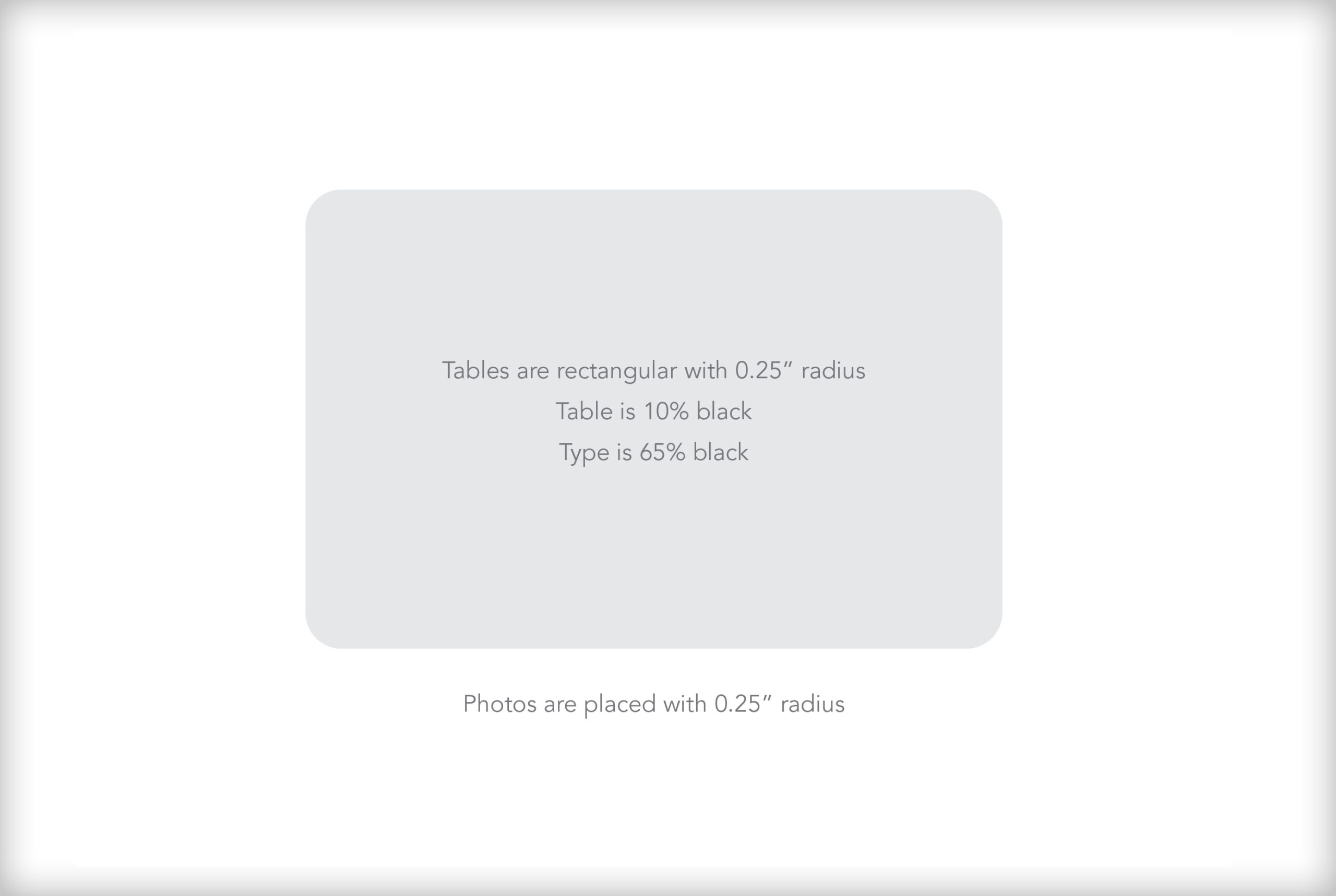
Tables are rectangle with 0.25″ radius corner
Table is 10% black
Type is 65% black
Photos are placed with 0.25″ radius corner
No strokes on the edge
Tomorrow’s spinal surgery solutions start here.
Learn more about how advanced, minimally invasive surgical solutions from Spinal Elements are transforming treatment and improving patient outcomes.
